Personal Injury Claims Platform
My Role — Lead UX & UI Designer · HAKEA for Mighty · End-to-end product design · Deliverables: UX strategy, information architecture, UI design system, multi-domain dashboard, onboarding flows, document management
The Problem
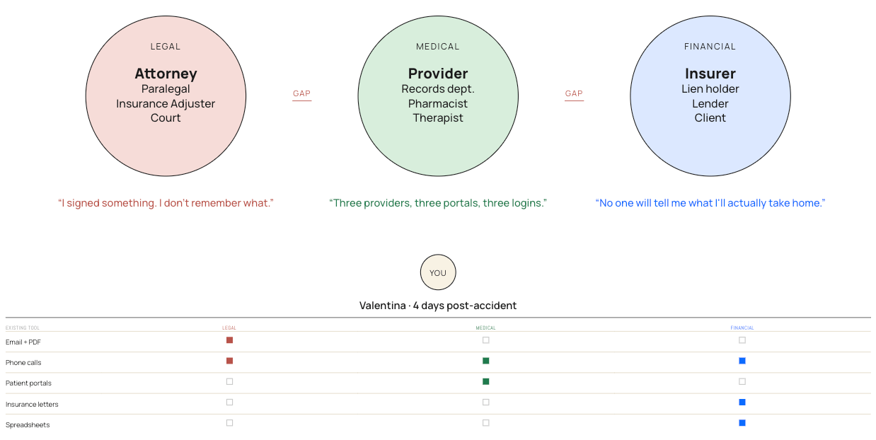
Being involved in a personal injury claim in the US means navigating three complex, disconnected systems simultaneously — legal proceedings, medical treatment, and financial settlements — while dealing with the aftermath of an accident. Most claimants had no single place to track where things stood, what was needed from them, or who to contact. The experience was fragmented, opaque, and deeply stressful at the worst possible moment.
The Design Challenge
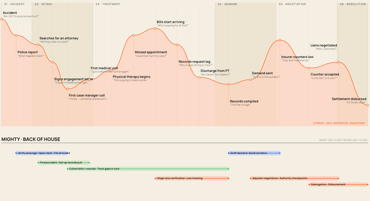
Three professional domains with different vocabularies, timelines, and stakeholder needs needed to feel like one coherent, reassuring experience to someone going through one of the most difficult periods of their life. The design challenge wasn't just information architecture — it was emotional architecture. Every decision about hierarchy, language, and interaction had to account for a user who was anxious, unfamiliar with legal process, and potentially in pain.
The Design Response
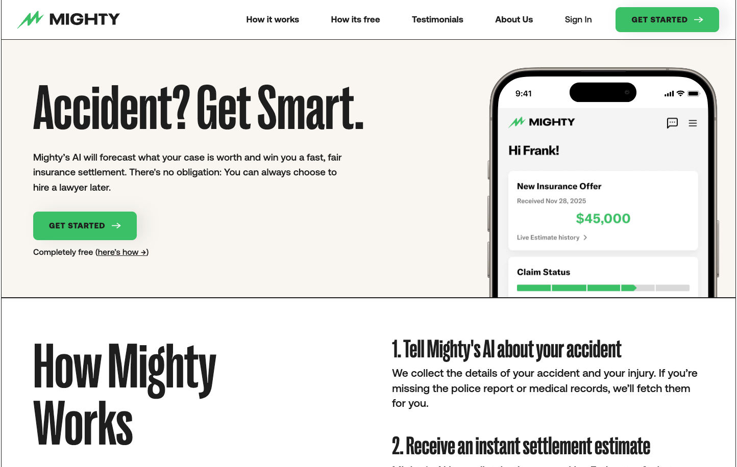
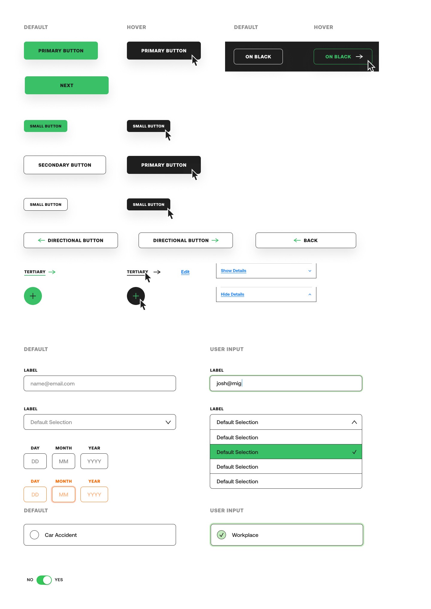
The solution centred on radical clarity. A unified dashboard brought together financial updates, medical records and timelines, legal status, and document management — all in one place, all in plain language. Rather than mirroring the complexity of the underlying process, the interface was designed to absorb that complexity and surface only what the user needed to know, and when.
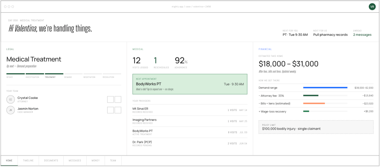
Timelines gave claimants a clear view of where they were in the process and what came next. Document management removed one of the most persistent sources of confusion. Direct communication pathways meant that reaching the right person never required navigating a separate system.
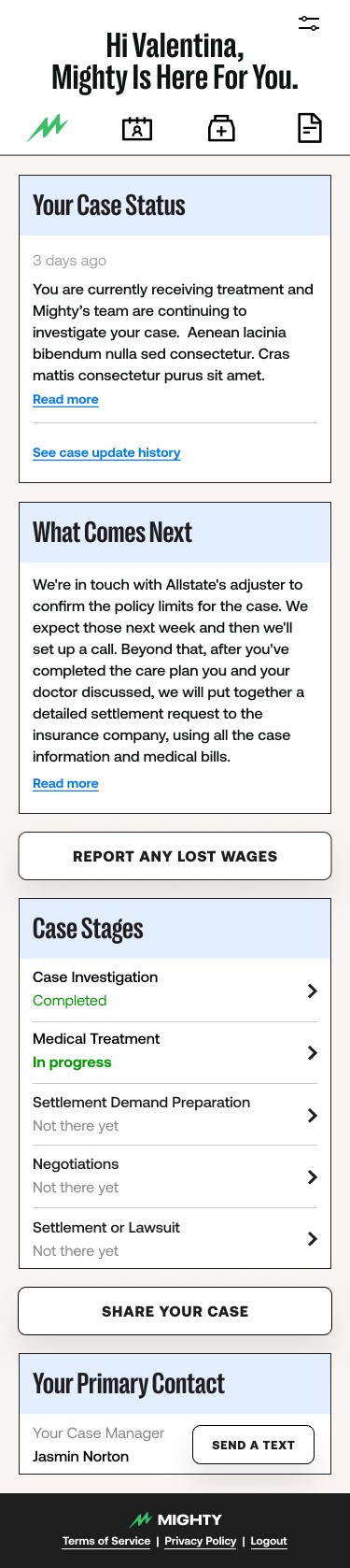
Every design decision was made with the emotional state of the user in mind — someone who needed clarity, not more complexity. The tone of the UI, the language choices, the notification design — everything was calibrated for someone who was unfamiliar with legal process and needed to feel guided rather than managed.
Outcome
The product earned exceptional feedback from users and delivered strong retention — a meaningful result in a category where most people would prefer never to need the product at all. In a space that had long prioritized process over people, the design put the claimant experience at the centre and proved that clarity is the most powerful thing a legal technology product can offer.
Full design documentation available on request.

Personal Injury Claims Platform
My Role — Lead UX & UI Designer · HAKEA for Mighty · End-to-end product design · Deliverables: UX strategy, information architecture, UI design system, multi-domain dashboard, onboarding flows, document management
The Problem
Being involved in a personal injury claim in the US means navigating three complex, disconnected systems simultaneously — legal proceedings, medical treatment, and financial settlements — while dealing with the aftermath of an accident. Most claimants had no single place to track where things stood, what was needed from them, or who to contact. The experience was fragmented, opaque, and deeply stressful at the worst possible moment.
The Design Challenge
Three professional domains with different vocabularies, timelines, and stakeholder needs needed to feel like one coherent, reassuring experience to someone going through one of the most difficult periods of their life. The design challenge wasn't just information architecture — it was emotional architecture. Every decision about hierarchy, language, and interaction had to account for a user who was anxious, unfamiliar with legal process, and potentially in pain.
The Design Response
The solution centred on radical clarity. A unified dashboard brought together financial updates, medical records and timelines, legal status, and document management — all in one place, all in plain language. Rather than mirroring the complexity of the underlying process, the interface was designed to absorb that complexity and surface only what the user needed to know, and when.
Timelines gave claimants a clear view of where they were in the process and what came next. Document management removed one of the most persistent sources of confusion. Direct communication pathways meant that reaching the right person never required navigating a separate system.
Every design decision was made with the emotional state of the user in mind — someone who needed clarity, not more complexity. The tone of the UI, the language choices, the notification design — everything was calibrated for someone who was unfamiliar with legal process and needed to feel guided rather than managed.
Outcome
The product earned exceptional feedback from users and delivered strong retention — a meaningful result in a category where most people would prefer never to need the product at all. In a space that had long prioritized process over people, the design put the claimant experience at the centre and proved that clarity is the most powerful thing a legal technology product can offer.
Full design documentation available on request.